How To Effectively Separate Colors For Screen Printing
Screen printing has long been one of the most popular ways to create printed t-shirts. This has primarily been because of how easy it is to learn, with the fact that it’s an affordable way to create a custom t-shirt, also being a significant advantage.
However, there can also be a number of things that can go wrong, as well as a few things that people may have difficulty understanding. One of the most notable of these is color separations. This is primarily because there are a number of different ways to do so, some of which will be more complicated than others.
By being informed about the various ways you can separate colors with screen printing, you’ll be able to make the right choice for you, regardless of whether you’re creating the t-shirts as a hobby or for a business.
Types Of Color Separations
Spot Color
Spot color has been the most common type of color separation for screen printing for several decades, especially when it comes to vector images. This is because it’s quite simple to so while still achieving quality results.
While the majority of design software will allow you to spot color, the more common ones to use are CorelDRAW or Illustrator, as these will automatically ensure that the color is right before you print.

Source: cre8iveskill.com
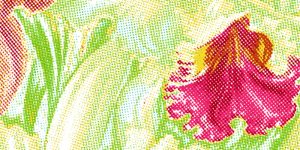
Spot color separations are normally solid. However, if you’re looking to create somewhat of a faded or shaded, then halftone dots should be used in the process. This will ensure that your design prints the way that you initially designed it.
Four-Color Process
The four-color process has been gaining popularity over the past few years. This has been in large part because of how popular Photoshop has become. This is where a designer uses halftone dots of CMYK (cyan, magenta, yellow and black) to create more photorealistic images on a custom t-shirt. Because of its main use in creating realistic looking images, it’s become somewhat of an industry standard.

Source: cre8iveskill.com
That being said, though, it can be much more difficult to ensure that these designs come out the way you intended. With that in mind, you should double-check the colors and overall design before you print it.
This will allow you to make sure that everything is the way you want it, which will prevent any unwanted, and potentially costly, mistakes from happening.
Simulated-Process Color
The simulated-process color method is surprisingly similar to the four color method in how it’s done. There are some significant differences, though. The first is that the simulated-process color method make use of halftone dots to create realistic images instead of the solid dots that are used in the four color method.

Source: cre8iveskill.com
The more obvious difference is that this kind of separation uses a range of ink colors. This will have quite a considerable impact on the design when it’s printed. Once done, the colors will be much more vivid than it would with any other process. This also has the added benefit of being much more appropriate if you’re printing on darker fabrics or materials. This vividness can also be seen on lighter colors.
Index Color
This is probably the easiest method to separate colors, although it’s also one of the more limited in terms of designs that can be made with it. This is because it uses square pixels of the same size, rather than halftone dots in order to create a shading effect.
While this can be an effective way to create simple, high-quality prints, it may not be suitable for more realistic ones. The process is normally done in Photoshop.

Source: cre8iveskill.com
However, if you’re using a different design software, you’ll be able to import the design and colors to it before printing. This is especially the case with CorelDRAW or Adobe Illustrator, although it should still be the case with the majority of other popular pieces of design software.
Tips For Creating Color Separations
When it comes to screen printing, the color separation you choose is one major factor. Regardless of which one you choose, however, you’ll need to ensure that you’re doing it to a high standard. This will ensure that you’re consistently creating high-quality t-shirts. To do so, there are a few different tips and tricks that you should follow.
The first of these is to ensure that the artwork you’re using is of a high standard. If you’re using a low-resolution image, then the final t-shirt will be of a low quality.
Because of that, you should check the resolution of the image prior to printing, which will help you to avoid some costly mistakes. While this may mean you’ll have to put more time and effort into creating or finding a design, it will pay off dividends when you print the t-shirt.
You should also address potential problems before they crop up. These can vary from each screen printing color separation, but they’ll all have their potential positives and negatives. There may also be a number of other issues that you mightn’t have expected. If you’re using Photoshop to create your design, for example, then you may need to rework the colors to prevent any issues.
This is because Photoshop’s CMYK color palette is best suited for printing on paper. Because of that, you shouldn’t use the software’s default color palette. This is because it may cause colors to leak or blend when printing on fabric, which can end up ruining the design once you’ve printed it. Thankfully, you can work around this by using different colors before printing the t-shirt. You can also use a separate piece of software that may be focused on t-shirt designs and printing.
There can be a variety of other potential problems that you might face when screen printing. However, knowing what these issues are before they have a chance to affect your designs can be the first step to preventing them. By doing so, you’ll be able to save yourself a significant amount of time and money trying to fix them after they occur.

